fabric Struggles
I am ready for a new English paper piecing project, and I know exactly what I want to sew. It’s the Rosemary quilt from Jodi Godfrey’s book, The Seedling Quilts.
So lovely! I have a copy of Jodi’s book, which is quite an inspirational volume. Rosemary will be my second project from the book, and she’ll be the easiest too. I love the concept of cutting big, beautiful rectangles of fabric and sewing just a few EPP flowers to dress up the quilt. Since the EPP is appliquéd, Rosemary is super beginner-friendly. First English paper pieced quilt, anyone?
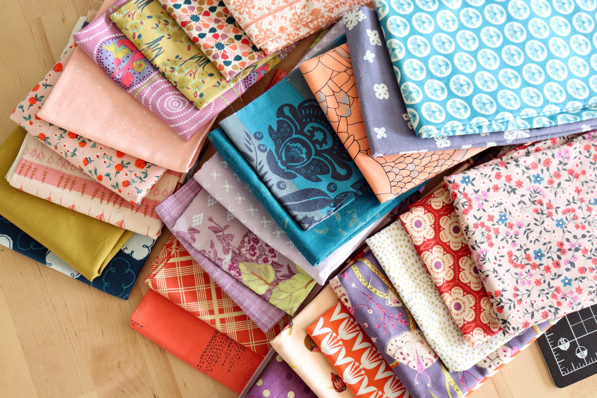
Jodi’s quilt is a mash-up of prints and colors. It looks effortless, so I started by pulling multicolor prints from my scrap drawers rather willy-nilly. It quickly looked muddled, so I added one or two-color prints to the mix to let the showier prints breathe.
Fortunately, I had already ordered a set of papers and acrylic templates for the Rosemary quilt from Jodi’s website, Tales of Cloth. Using acrylic templates really helps because you have to cut rather odd shapes for EPP and the clear templates make fussy-cutting a cinch. So, I went ahead and cut shapes for one flower and started sewing.
But it was slow going, and I know why. I had the feeling I was sewing in the wrong direction. That’s like walking I the wrong direction, but then with your needle. I really had no idea if I would like my quilt because I had approached the fabric selection phase too casually. Yep, a little more preparation is in order.
Here I have cut rectangles from most of my fabrics and put them up with my first Rosemary flower. Yowsers, this is not good.
Let’s try that with fewer large-scale prints and totally remove the dark value ones.
Hmm, better. Still that butterfly print is too distracting and I think that the white background eucalyptus prints do not flow well with the solid cream backgrounds I will use behind each of my Rosemary blocks.
After making those adjustments, I like it better. Still, I’m not in love. There’s something so light and springy about Jodi’s version; whereas, mine has more contrast. I do feel committed to using that large-scale Anna Maria Horner print called Brimming from her Bright Eyes collection. I really love the fabric, but have never found the right chance to use it. This quilt does seem like the ideal way to use a showy, large scale print, so I don’t want to miss the opportunity.
Well, I went for it - - - I’ve cut and arranged all my fabrics for the Rosemary quilt layout. I used up my whole fat quarter cut of Brimming! Each white block will get a Rosemary EPP flower, of course.
Okay, can you give me some feedback? Given that I want to use the Brimming print, is there one or two other prints that you would suggest removing? In other words, does something stand out in a bad way or do you have any other tips for me regarding my fabric mix?
Thanks for your thoughts!


