Honeycomb Stars: Fabric Planning

Woohoo, it’s time at last to start enjoying together the making of a Honeycomb Stars quilt! I’m very much looking forward to sewing alongside you. Cutting and sewing this project is wonderfully rhythmic. I’m eager to get lost in the flow.
Are you wondering if it’s too late to join in? Course not! You can totally join us. Hop over to the master sew-along post for all the info and dive right in, friends.
Today’s post is all about fabric - making choices and organizing your fabrics as needed for the pattern. Let’s get started!
Monochromatic vs. Multicolor
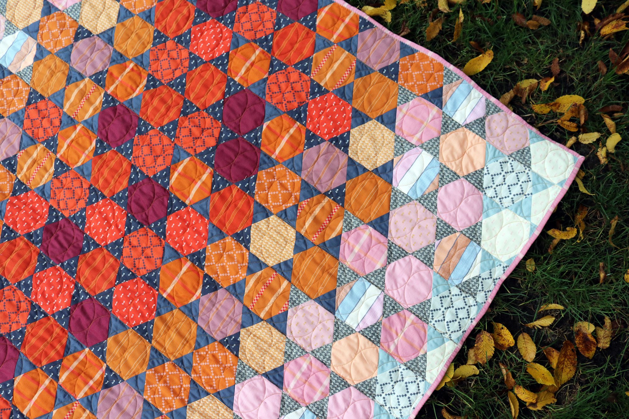
First let’s look at the big picture. I’ve sewn two drastically different Honeycomb Stars quilts. The Starry Night version is mostly monochromatic, with lots of blue-gray.

This focused color scheme allows the value dynamics to truly shine. Wouldn’t you say that this version has a feeling of really glowing in a way that the floral version does not? If you want to maximize the drama of the change in value from quilt center to the edges, consider a simple color scheme.
Of course, my Starry Night is not actually monochromatic - hello peach at the edges! Prefer a more minimalistic palette? Use white hexagons at the edges, for your value D fabrics. Or, try a contrasting bright, light value color for value D as I’ve done. Starry Night quilt kits are available at Dragonfly Quiltworks and shipping now.
The simplicity of a focused color scheme makes it much easier to sort fabrics by color! Consider using different types of prints, from geometrics to natural shapes and motifs, to add interest to your patchwork.
Maybe you’re drawn to the exuberance of a multicolor palette? It can definitely be done! With a multicolor palette the colors grab attention, softening the impact of the value blend. That’s totally ok, it’s just a different look!
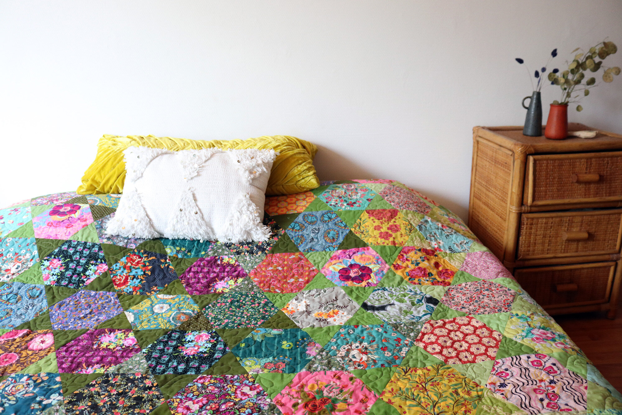
For success with a multicolor Honeycomb Stars quilt, I encourage you to focus on narrow print style. For example, my Frolicking Florals quilt is all about florals. I didn’t use geometrics like stripes or dots or plaids.
My Warp & Weft version is also multicolor, but uses only geometric prints. Minimizing the variety will allow the eye to more easily discover the value pattern in the finished quilt. With this quilt less can often be more, because repetition is part of the magic.
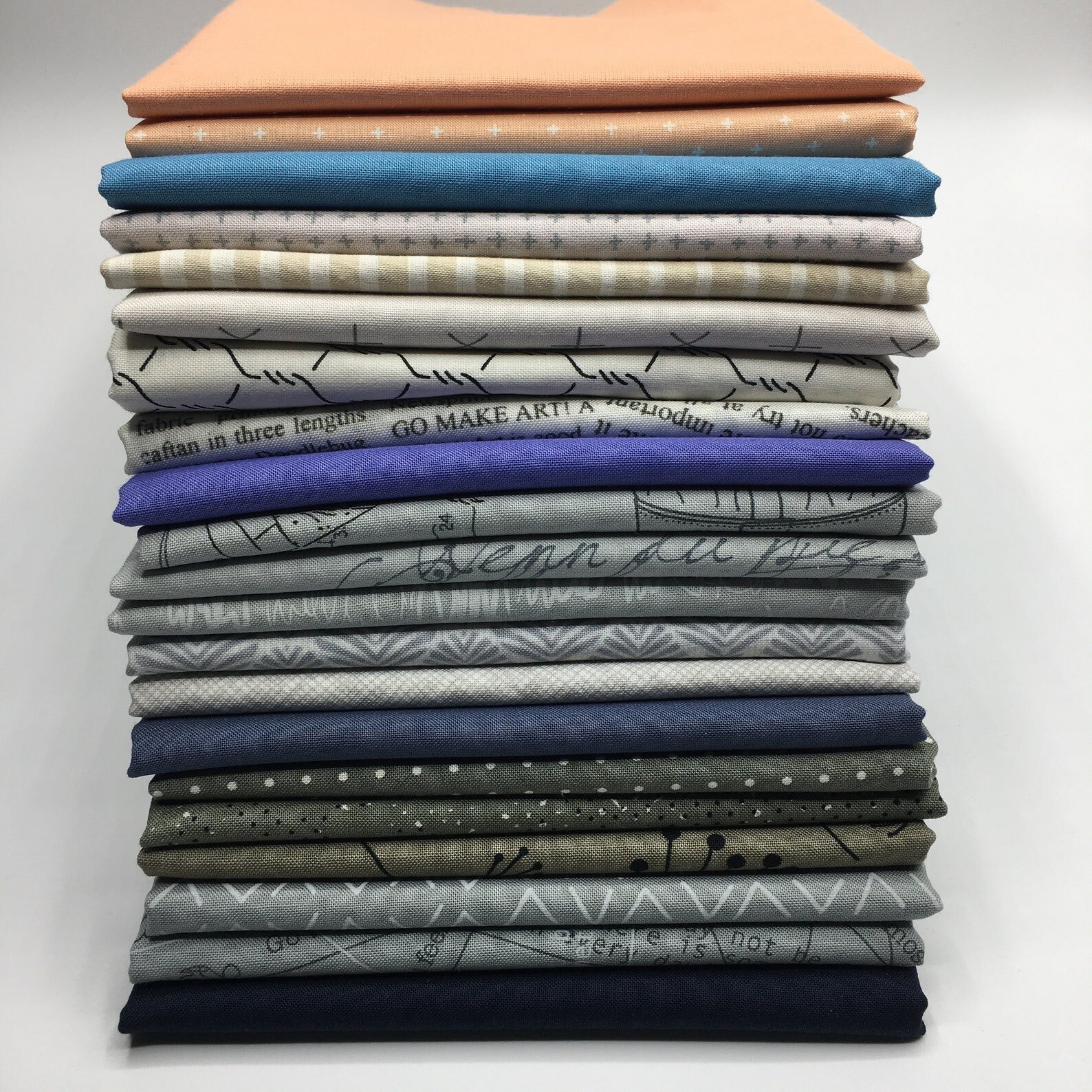
Sorting Fabrics
Now let’s get familiar with the Honeycomb Stars quilt pattern. Look over all the pages to get a feel for how the quilt is sewn. It’s pretty straightforward!
You’ll notice that the fabric requirements are organized into four value categories, from dark value to low value. These same categories are used for cutting and quilt layout. Sorting your fabrics into the four categories is your task this week.

Pattern page 2 goes into detail about value as it relates to color for patchwork. That should get you started. If you’re struggling with organizing your fabrics into value categories, here are some extra tips:
Use more single-color prints. Multicolor fabrics are the hardest to sort by value and the more colors, the bigger the challenge.
Watch out for big prints. Large scale motifs can morph into different value categories when cut up, especially if you’ll be cutting the smaller scale hexagon. The white parts of the print might dominate one hexagon, while the darkest parts of the print dominate another.
Check the grayscale. Still not sure? Photograph your fabrics grouped as best as you can by value category. Use the Instagram “Inkwell” filter to see the photo in grayscale. With the colors removed it’s much easier to confirm those value decisions.
Value vs. Color
One last thing. If you are making a multicolor version of Honeycomb Stars, you might be tempted to sort your fabrics by color instead of by value. That’s natural because color is related to value and much easier to pinpoint.
Let’s look at the different effect when my Warp & Weft quilt kit is sorted by value versus by color:


The quilt mock-up on the left is organized by value, causing the quilt to glow and blend between sections. The quilt mock-up on the right, which is organized by color, feels more flat and the color sections distinct. My preference is definitely for organizing by value. How about you?
Share to win!
This week share a photo of your Honeycomb Star fabrics organized in value groupings with hashtag #HoneycombStars.
I would love to see your fabric choices! Don’t have all your fabrics yet? That’s ok. Share what you have to join in the fun.
Your photo enters you into a giveaway for my Trimmings Pattern Pack. Tis the season to be sewing your handmade holiday or a festive gift for someone special. This 3-part pattern set offers some super fun choices! Winner will be announced Monday, October 18 and giveaway is open worldwide.

good luck, friends!