Choosing Fabrics for Wild Oranges quilt

So, you already have your copy of the Wild Oranges pattern? Thank you and you‘re welcome! Now, let’s talk about those fabric choices.
Ok, you know that I love a good scrap quilt, but I don’t think Wild Oranges is ideal for scraps. For me, this quilt is really about the interplay of shapes with the orange peel block. A busy, scrappy look will obscure that design element. If you do use scraps, be picky about your target colors and use repetition whenever possible to avoid visual overwhelm.
First read over the Color Concepts in the pattern. Will you be working from your stash or featuring a fabric collection with your Wild Oranges quilt? Here are two possible flows for selecting fabrics.
Starting with Stash
Your goal is to mainly use fabrics from your stash, filling in with purchased yardage as necessary.
no. 1 Main Color
What color will your Wild Oranges quilt be, if you have to choose one focus hue? I highly recommend that you select a solid fabric as your main, theme color. This will be fabric M1 per the pattern, with 1 1/4 yards required for the throw size quilt. You’ll likely need to purchase this particular ingredient. Choose a color that really speaks to you at this moment!
no. 2 Coordinating Light Color
Next, identify a coodinating light color for fabric L1. Again, I highly recommend a solid fabric. M1 and L1 are your main background colors and set the color mood for the quilt. Solids (or near solids) give the orange peel blocks the most definition. I prefer an L1 that is quite close to M1, just lighter in tone.

Here are my M1 and L1 fabrics for my Kismet Wild Oranges. Sometimes they look practically identical, but in good lighting it is clear that L1 is lighter. Did you notice that purple solid with an “X”? I eliminated this color from my palette in order to keep the color scheme more focused: reds, oranges, pinks.
no. 3 Showy Print
Now that you’ve set the color mood for your quilt, browse your stash for a favorite print that matches that mood. Use this showy print for M4. Ideally it has only colors that are the same or analogous to the colors of M1/L1. Use this anchor print to inspire the rest of your quilt palette.

My pick for M4 is my very favorite Kismet print.
no. 4 Fabric Key
Print out the Fabric Key on pages 5-6 of the Wild Oranges quilt pattern. Choose your remaining fabrics with an eye to the fabric hints given on the Fabric Key. I suggest that you use your darkest dark for fabric D3.
Starting with a Collection
Your goal is to use a favorite fabric collection, which offers a range of values from dark to light.
no. 1 Find Medium 1
Sort the fabric collection from light to dark. If you are planning digitally, try saving the fabric images to your computer desktop, where you can rearrange them in value order. Looking at the medium-value fabrics, choose a relatively simply print in a favorite color to be your M1 fabric.
no. 2 Find Dark 3
You don’t have to use all of the fabrics in the collection, of course. Looking at the dark value fabrics, which is the darkest that you would like to include in your Wild Oranges quilt? The darkest value is your D3 fabric. I suggest that you use lighter dark fabrics for D1, D2 and D4. If you choose, for example, a black print for D3, avoid using black prints for the other dark fabrics, unless your overall color scheme is quite dark.
no. 3 Fabric Key
Print out the Fabric Key on pages 5-6 of the Wild Oranges quilt pattern. Choose your remaining fabrics with an eye to the fabric hints given on the Fabric Key. I suggest that you use your favorite showy print for M4. If possible, choose a print for L1 that is very similar to M1, just lighter. For example, it might be the same print from the collection, but in a lighter hue.
no. 4 Juggle
Finding it difficult to source all the right fabrics within the collection? Consider adding in a few solids to better fulfill your color/value vision for the quilt. Solids will actually help the printed fabrics look better than ever! In my opinion M1 and L1 are great as solid fabrics. You might need to do some juggling to rework your plan with this in mind.
Example Palettes
Would you like some examples? I chose fabrics for imaginary Wild Oranges quilts using two fabric collections currently available at Winter Creek Cloth. If you’d like either of these examples as quilt kits, please contact Winter Creek Cloth. They have all the details from me regarding prints and cuts.
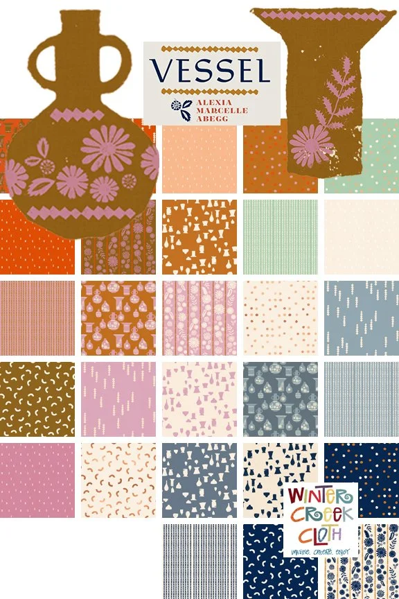
Vessel by Alexia Marcelle Abegg
This playful collection has a full range of values from dark to light. There are more fabrics here than I will need. For starters, I eliminate the green fabrics for Wild Oranges quilt in order to keep the palette more analogous: blue/purple/red. Of course, the brown and white neutrals are stil welcome.
Below are the mix of fabrics that I actually chose for a Vessel Wild Oranges quilt. I wonder, which colors feel predominant to you?
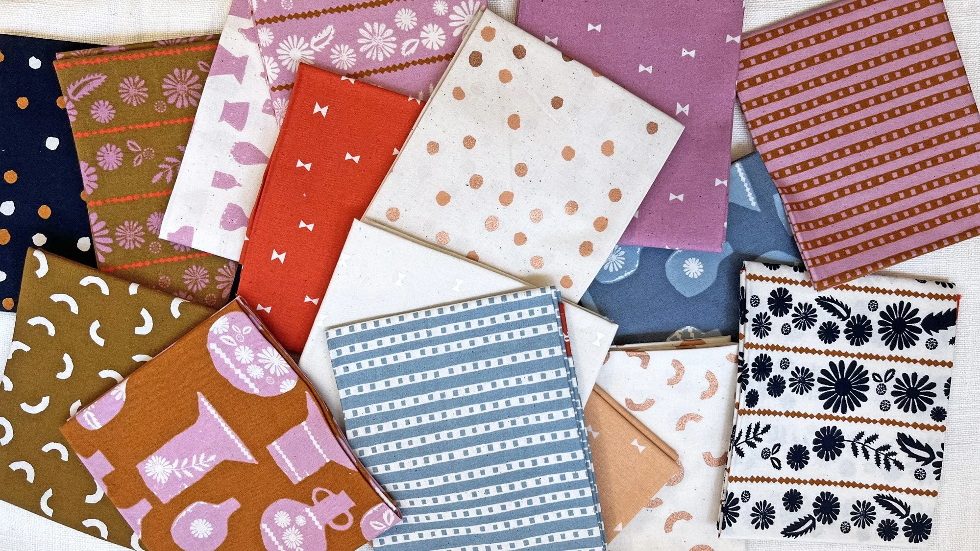
I was drawn to the browns and purples the most. Notice that I only used one of the dark navy Vessel prints (for D3). My other darks are not so dark, so as to reduce the overall contrast.
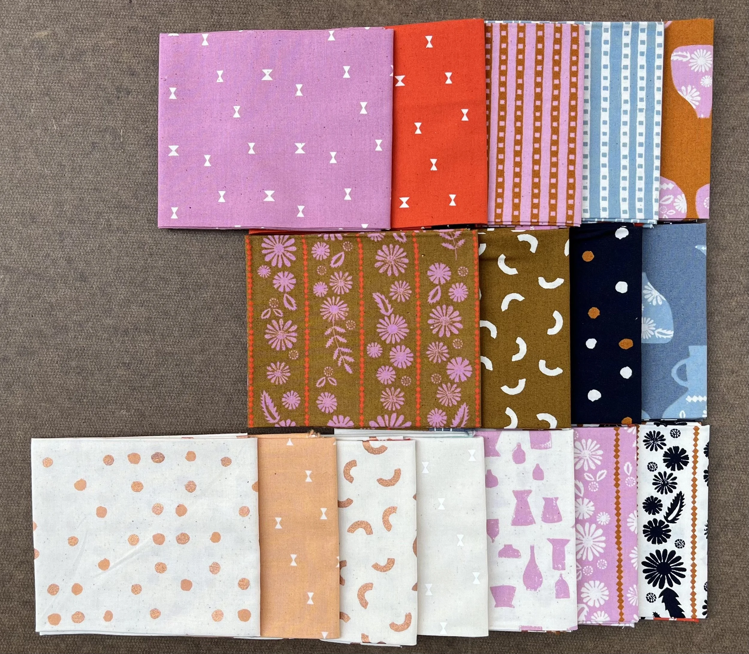
Here are those Vessel prints organized by value for a better look. The top left purple print is my M1, dominant color and fabric. Thus, the top row is medium value fabrics. The middle row is dark value and light values are at the bottom. I choose that pretty Metallic Paint Dot in Copper (bottom left) as my L1 print; however, a very pale purple solid might be an even better option for L1, what do you think?
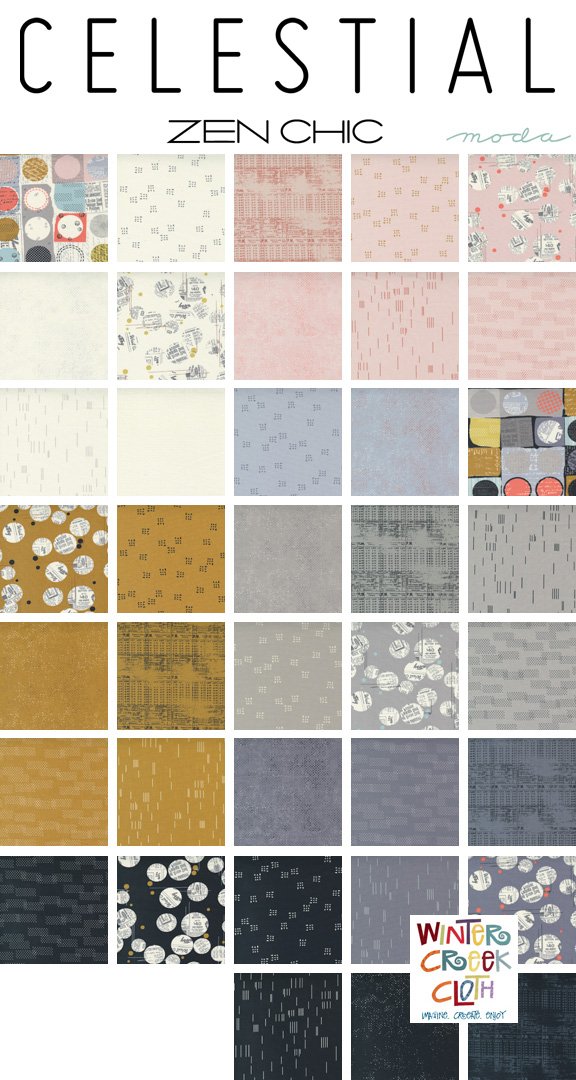
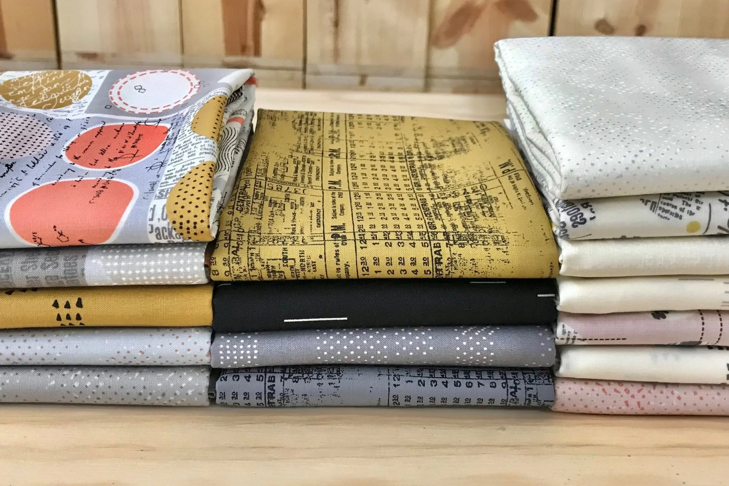
Celestial by Zen Chic
Celestial is an even bigger collection! Lots of options here.
Once again, I’ll eliminate many of the darker fabrics, because I don’t want to use too many black darks. That would make for a high-contrast quilt, which will be more visually busy. I’ll use just one of those black fabrics for my D3.
I can use all of the colors, but not in equal quantities. I’ll follow the designer’s lead and use gray as my main focus color. Gray beautifully compliments all the colors offered in the Celestial palette.
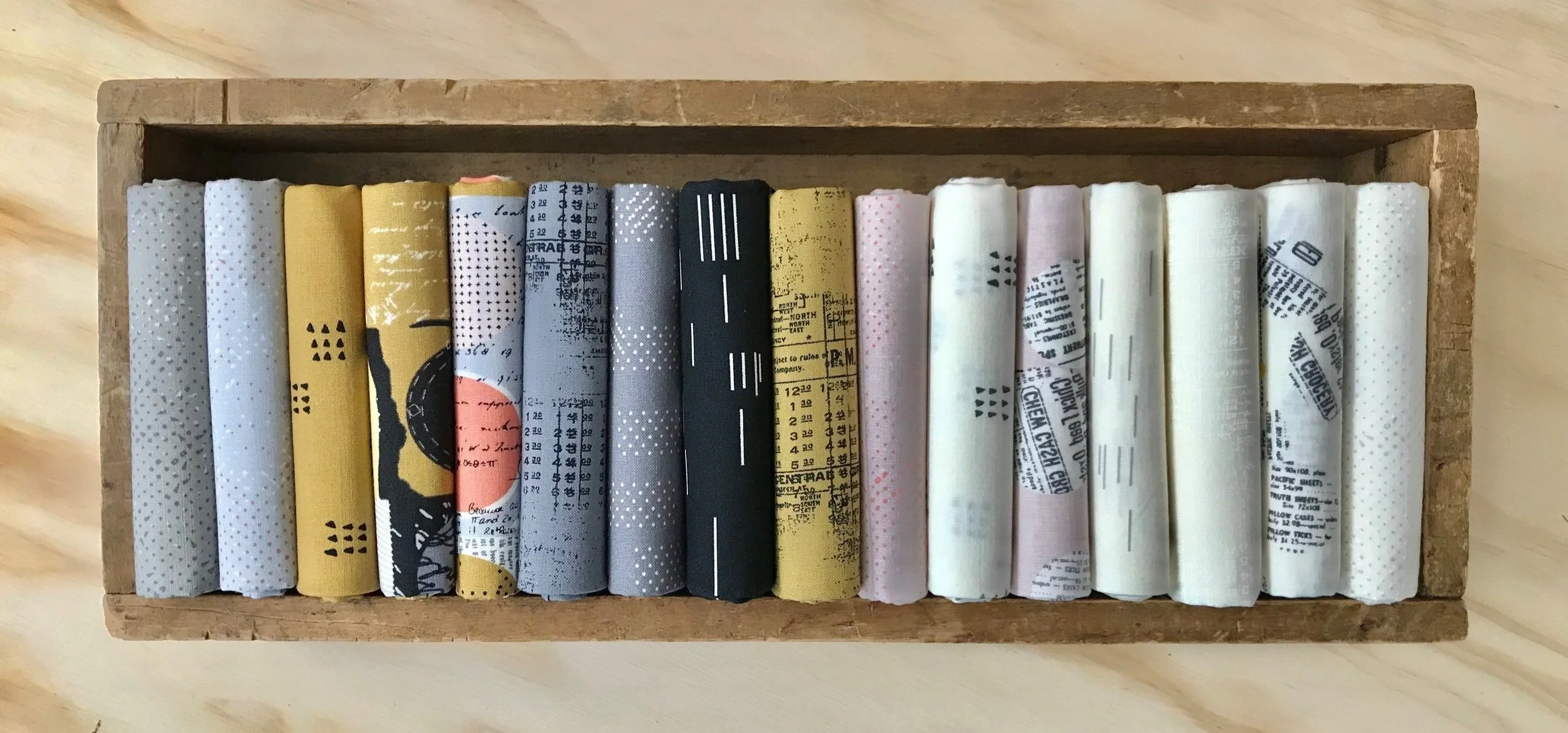
Here are the Celestial prints which I’ve chosen for Wild Oranges. This collection has a very “zen” vibe and would make a serene Wild Oranges with more of an urban feel. Obviously, the multi-color dot prints are the most showy, so I chose those for fabrics M4 and M5.
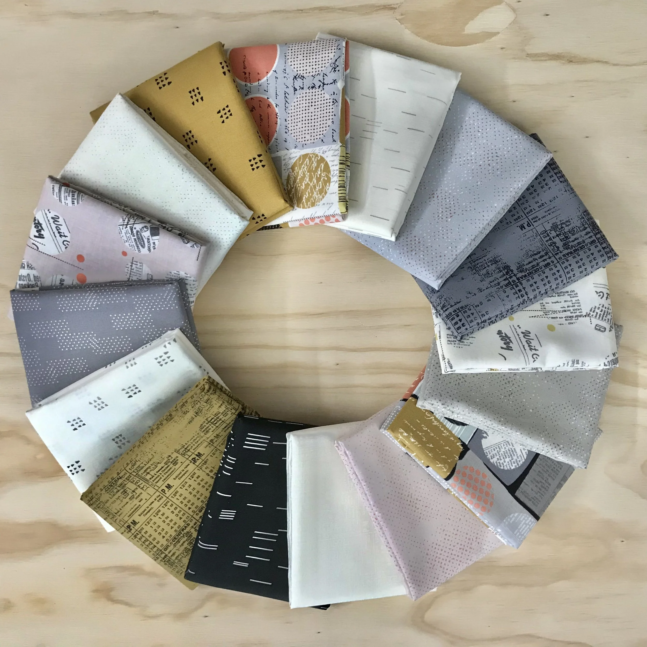
There are lots of Spotted blenders on offer, which can serve as “solids” from a design perspective. I selected Spotted Stone for M1 and the ligher Spotted Moonbeam for L1.
Here are my picks organized by value: medium value at left, dark value at middle and low value at right. I’m confident this would be a lovely Wild Oranges quilt and wish I had the time to sew it myself!
I hope these tips and examples are helpful, my friends. Enjoy gathering your fabrics for Wild Oranges. I’m sure you’ll surprise me with fresh new ideas and perhaps a scrap version or two that hits it out of the park, haha! If you have any other questions regarding fabrics, don’t be shy to pose them here. I’m happy to share my perspective.
Please share your fabrics pulls on Instagram with #wildorangesquilt. You can get feedback there too, if you’re having trouble choosing! The first fabric pull is already up from @buroaklife and it’s an autumn beauty!!!


