late summer Improv
It is the first day of August, the warmest month, when the wild days of summer burn themselves out. I have begun a new quilt with green as my mental starting point. Lively, living green. It brings the energy of growth and the relaxing cool of the shade.
But somehow my fabric pull doesn’t look so very green - - -

That’s because I want to do green + red. Of course, green and red say “Christmas” and that is not what I have in mind. I’ve added other colors in order to soften the holiday connection. I added the Michael Miller Candy Bars striped print because it is so perfect for summer. That print invited me to welcome pool blue, pale peach, washed out brown and soft orange. Those earthy shades suit me fine.

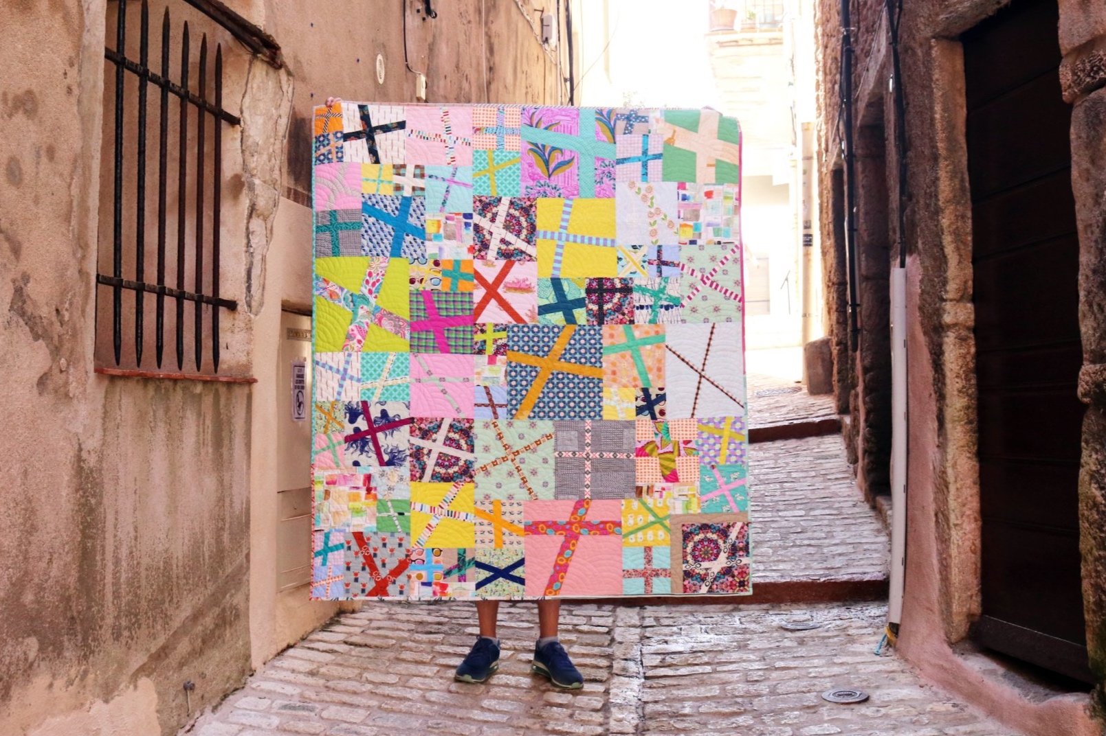
What for patchwork? I did a little browsing for ideas and came across a quilt I’d bookmarked years ago by the talented @AraJane. The wild energy of her improv is speaking to me! I’m imagining something similar with a lot of green in place of black/gray. This weekend I started cutting and sewing without rulers. Here is what happened.

The green block came first. I started this one with a square fabric scrap in the Pearl Bracelets print. It turned out tall and chunky instead of long, which did not satisfy. My second block began with a long, thin rectangle of the strawberry print from Heather Ross. This one turned out delightfully long. I love its proportions!
Cutting without a ruler produces free-flowing, soft lines. But, it is harder than I remember. It is the mental game, not the technique, that is challenging. At this point I cannot yet predict how a block will turn out until I sew it. It’s difficult to let go and let be. Sometimes I’m surprised, delighted or disappointed. The lack of the control is an adventure for sure.

Next I tried for smaller blocks. It turns out a don’t need much fabric to make a cute little block.

And so it keeps growing!
At this pont the quilt is looking more green + orange than green + red. That’s because I’m using red-oranges instead of red-blues. I keep trying cooler blues, but they do not feel right. In contrast, that Rifle Paper Fabrics Camont Poppy print with the black background feels spot on. It’s dramatic and definitely not Christmas. I hope to continue in the same vein.