Value: Quilter's Color Quest

Let’s continue Quilter’s Color Quest today with Experiment 7: Working with Value. Flip to page 56 in The Quilter’s Field Guide to Color: A Hands-on Workbook for Mastering Fabric Selection to join us.
Value can be a confusing concept. The term is a little odd, and its meaning stands apart from color itself, though the two are related.
“Value refers to the relative lightness or darkness of a fabric, as compared to the other fabrics around it. ”
I first came across this term in the context of quilting in July 2010. This post titled "Inspiration: Value Quilts” chronicles my “aha” moment when I realized that quilts with high value contrast make my heart sing.
On page 58 of the book, I compare two of my patchworks, expressing disappointment with the outcome of the low value contrast example and satisfaction with the high value contrast example. But in truth, there is no right or wrong here. Some people really enjoy low volume contrast and create beautiful, dreamy projects. I love to look at those.

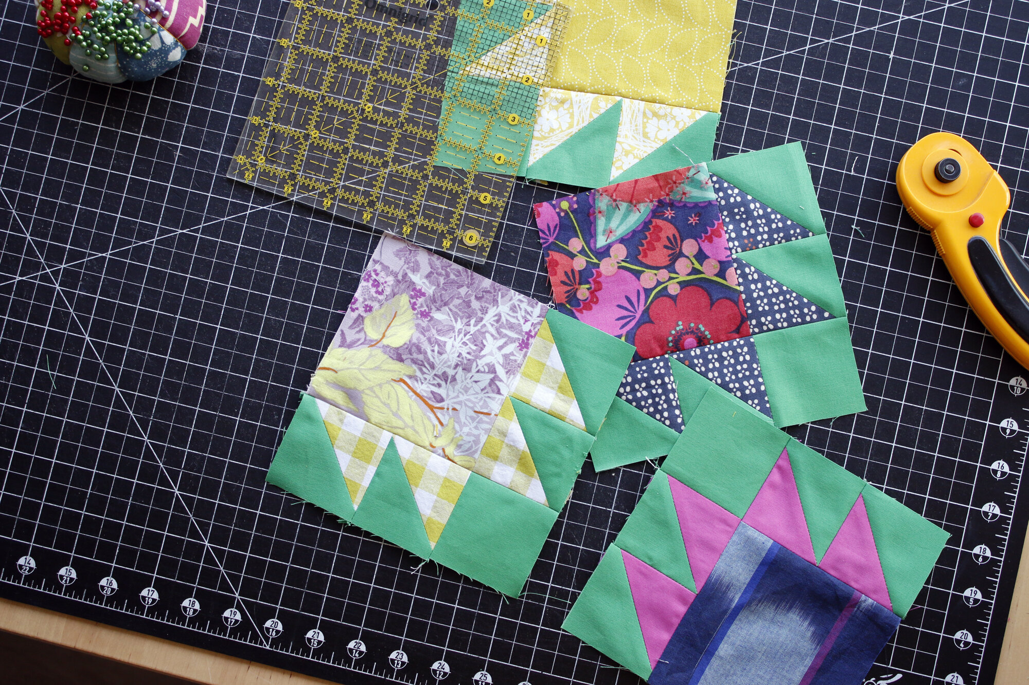
The concept of value is an important one for all quilters to discover. Some quilt designs just can’t be themselves without careful use of value. For example, my Ikat quilt pattern relies on three levels of value contrast in order to define the patchwork. I’ve made two versions of this quilt, one with heavy contrast and one with minimal contrast (Clementine Ikat, above). Either way, the value choices are deliberate and prescribed by the pattern itself. In fact, I wrote the pattern with value-coaching in mind.

Take the Challenge
With Clementine Ikat quilt I pursued a monochromatic orange color scheme, plus neutrals. I think the concept of value is particularly helpful when working in such a limited color scheme. That’s why our exercise for Value (pg 64) involves working with one main color - monochromatic.
After the heavy lifting of the last few challenges, this swatch exercise is easy peasy! I forged right ahead to the patchwork challenge.
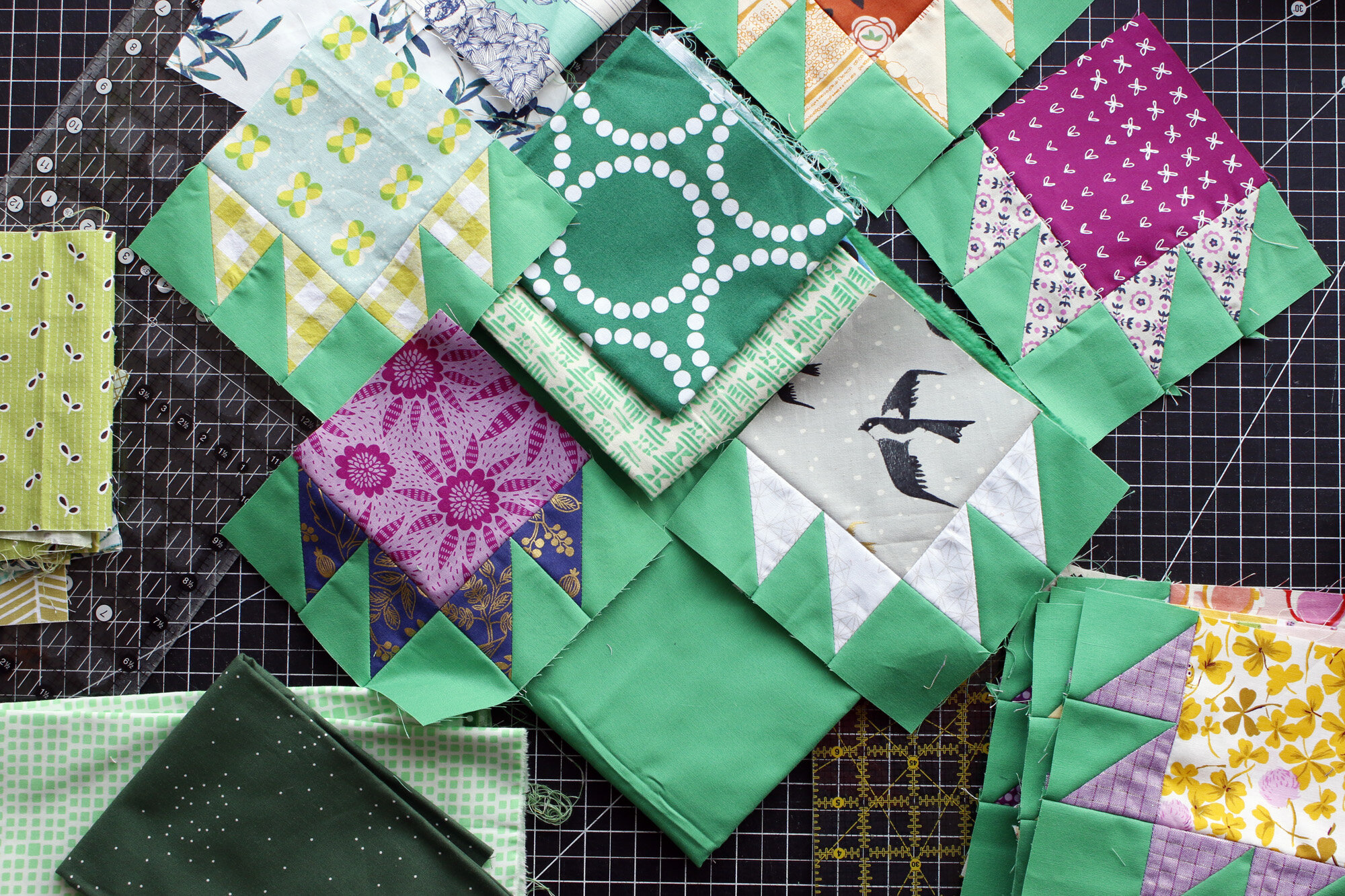
My background fabric is already green, so I’ve set out to make monochromatic green blocks. I usually choose fabrics for each challenge without consulting my existing blocks, but this time I decided to pull them out to discover what green values might mix well.
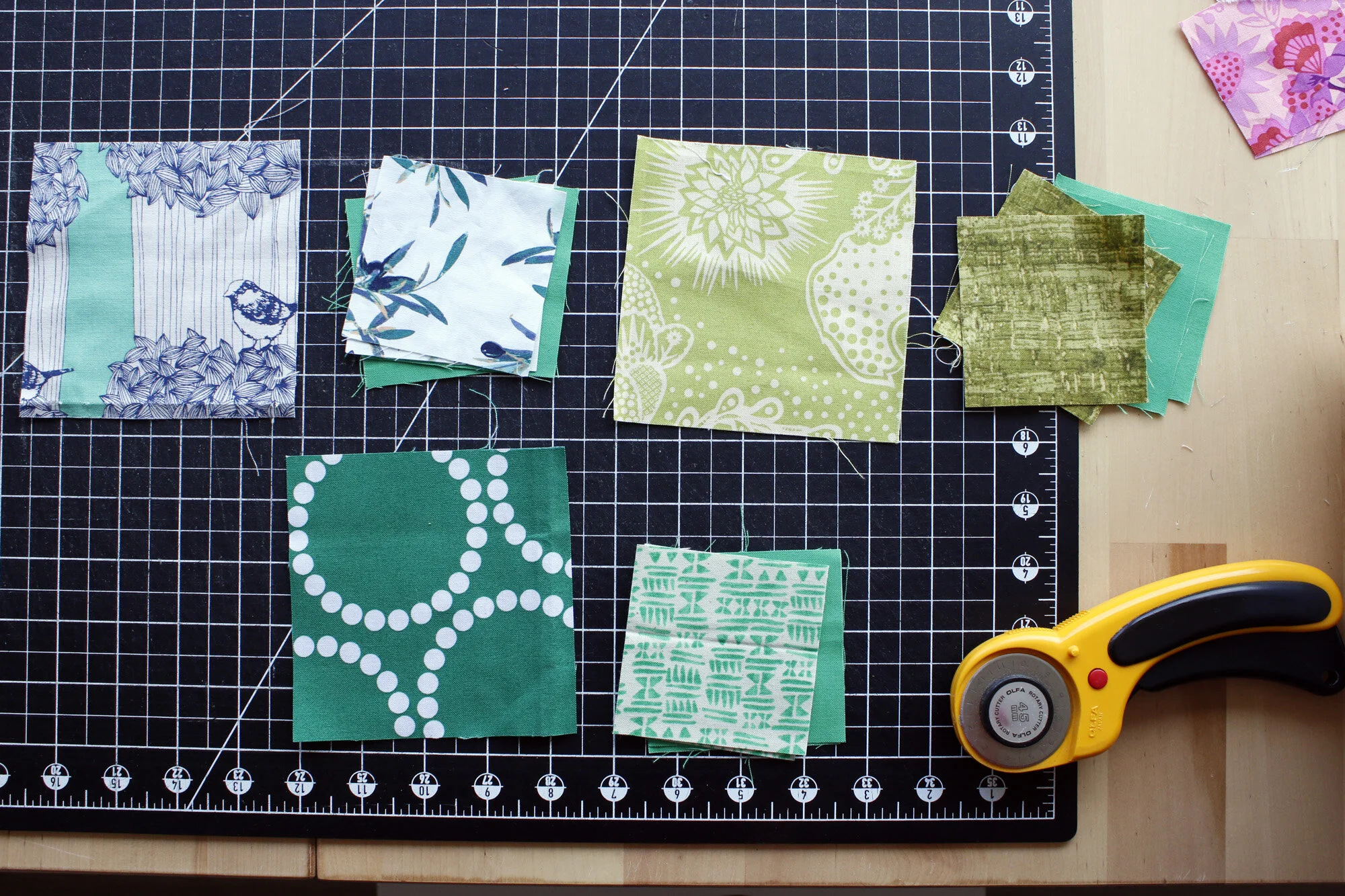
I decided I preferred to skip the darkest values - my super dark greens - and keep things on the light side. You’ll notice I included greens with a yellow tint (top right) and greens with blue undertones (left big squares). When you’re creating a monochromatic scheme these undertones will become more obvious. Don’t be shy about mixing them all together.
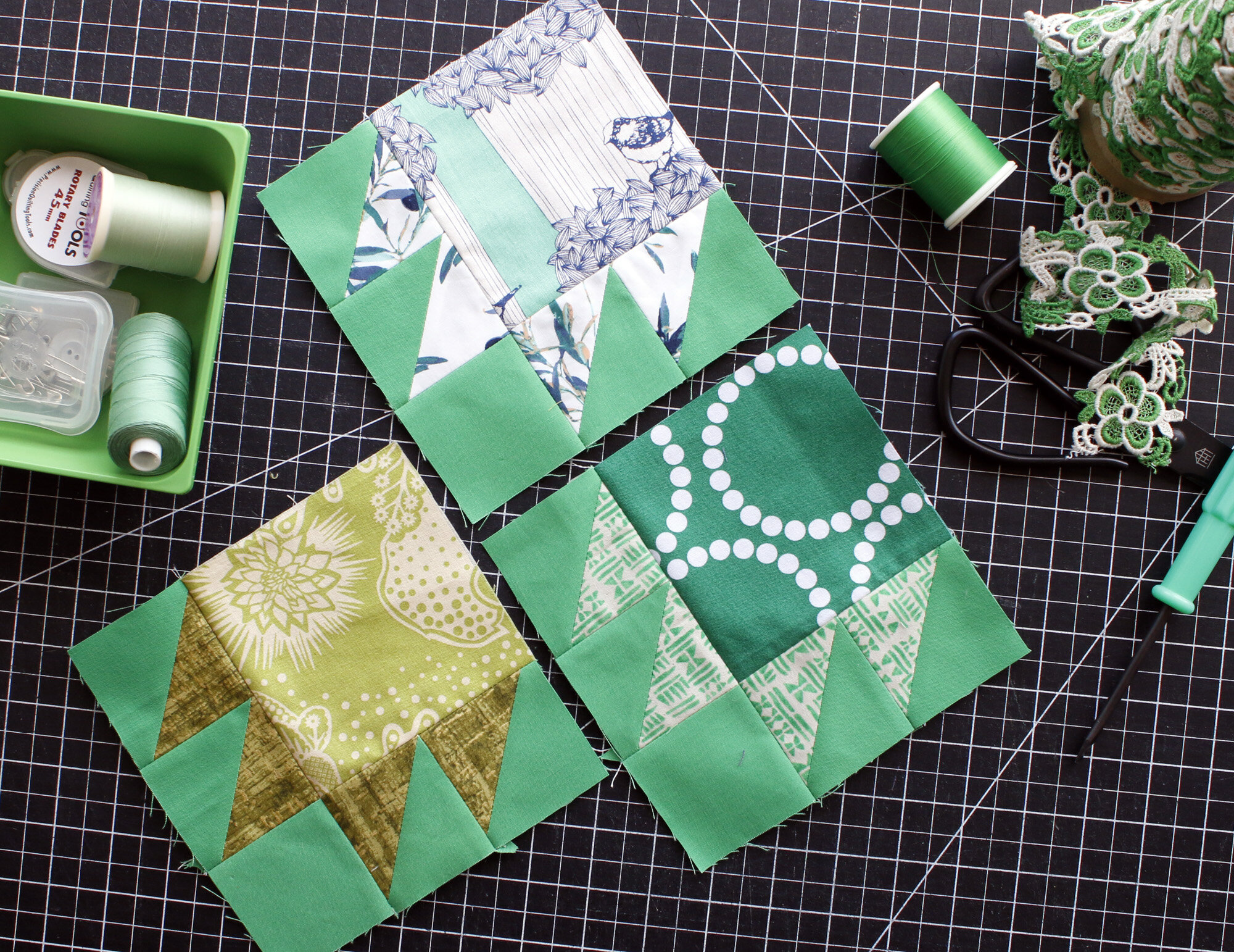
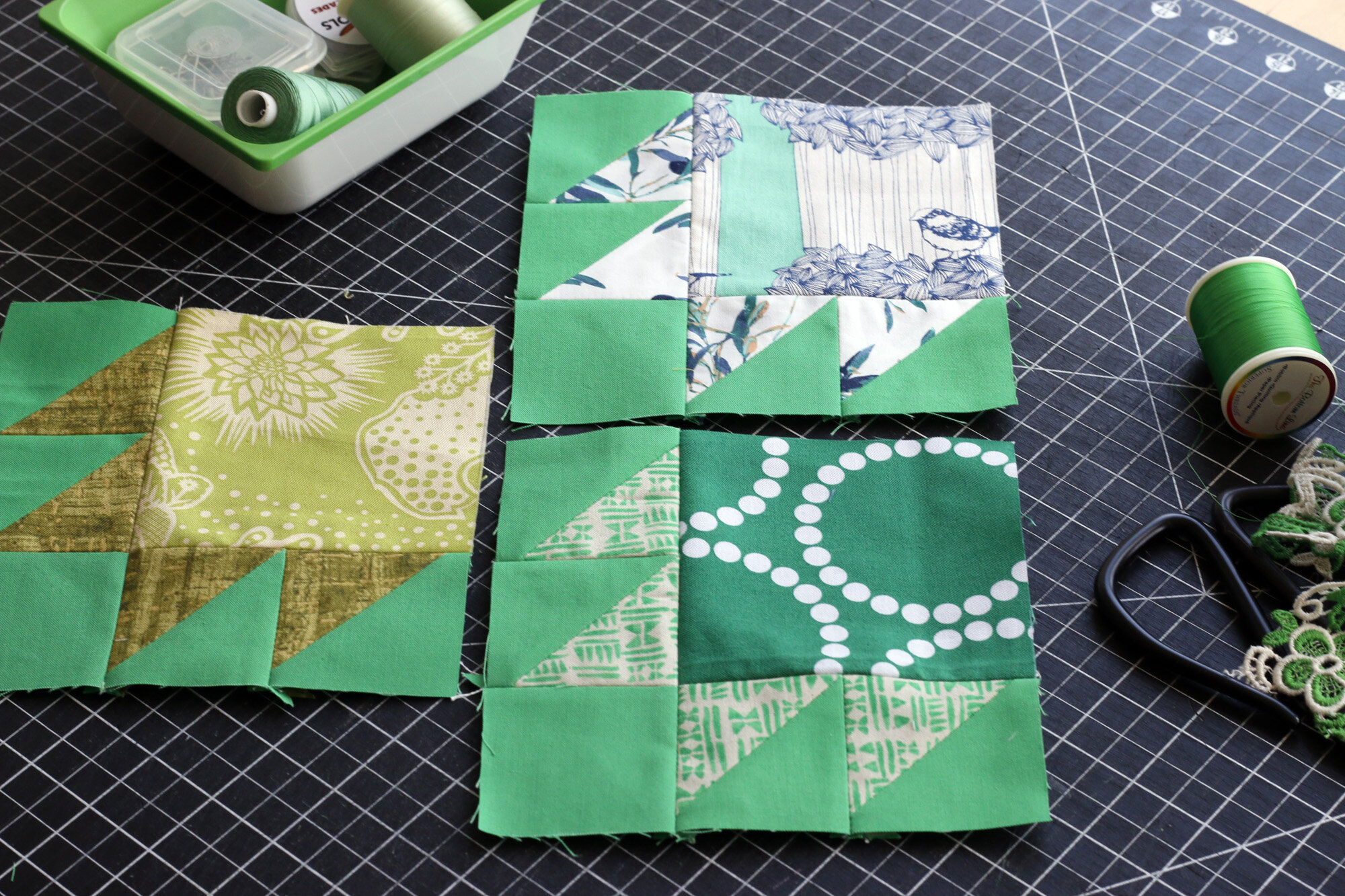
Sigh, I do so love green!
This month, do one or both challenges for Value. Share a photo of your results on Instagram with #QuiltersColorQuest and #QuiltersFieldGuidetoColor. Each month I’ll be drawing one random winner from those who use the Color Quest hashtag. Each photo is a chance to win fabric.
Have fun!