Color Wheel: Quilter's Color Quest

Ah, now we find ourselves face to face with that classic color tool - the color wheel. Mid-way through the month, I hope you can take a breather to contemplate the Color Theory section of The Quilter’s Field Guide to Color, which begins on page 36. It’s time for “Exploring the Color Wheel”!
Want to come along for the ride? To join, get a copy of my book, subscribe to this blog and follow #quiltersfieldguidetocolor and #quilterscolorquest on Instagram.
Each chapter we’re exploring together has challenge exercises to help you engage with the content. I’d love for you to share photos of your swatch challenges and/or patchwork challenges to Instagram so that we can all learn and grow together!
This chapter focuses on two important color wheel concepts: analogous vs. complementary colors. This is probably not brand new information for you, but set in the context of choosing fabrics, you will hopefully understand more about how an analogous vs. a complementary scheme would effect a project.
At any rate, it’s always good to practice using the color wheel! Sometimes structure is just what you need to feel more confident. Confidence is one vital key to enjoying color play!

The swatch challenge in this chapter is a particularly good one. On page 42 the challenge starts with choosing one color swatch that particularly appeals to you today. I chose Mauve, which is the warm, dusty purple shown on my page at top left. Under the analogous heading, I chose three other color swatches to create an analogous scheme. I have to say, I really like what emerged! I haven’t used this range of colors together before, but I think I would really enjoy it.
Below, under the complementary heading, I paired Lemon yellow with Mauve for a complementary scheme. It’s simple and sweet. I’ve definitely done that before!
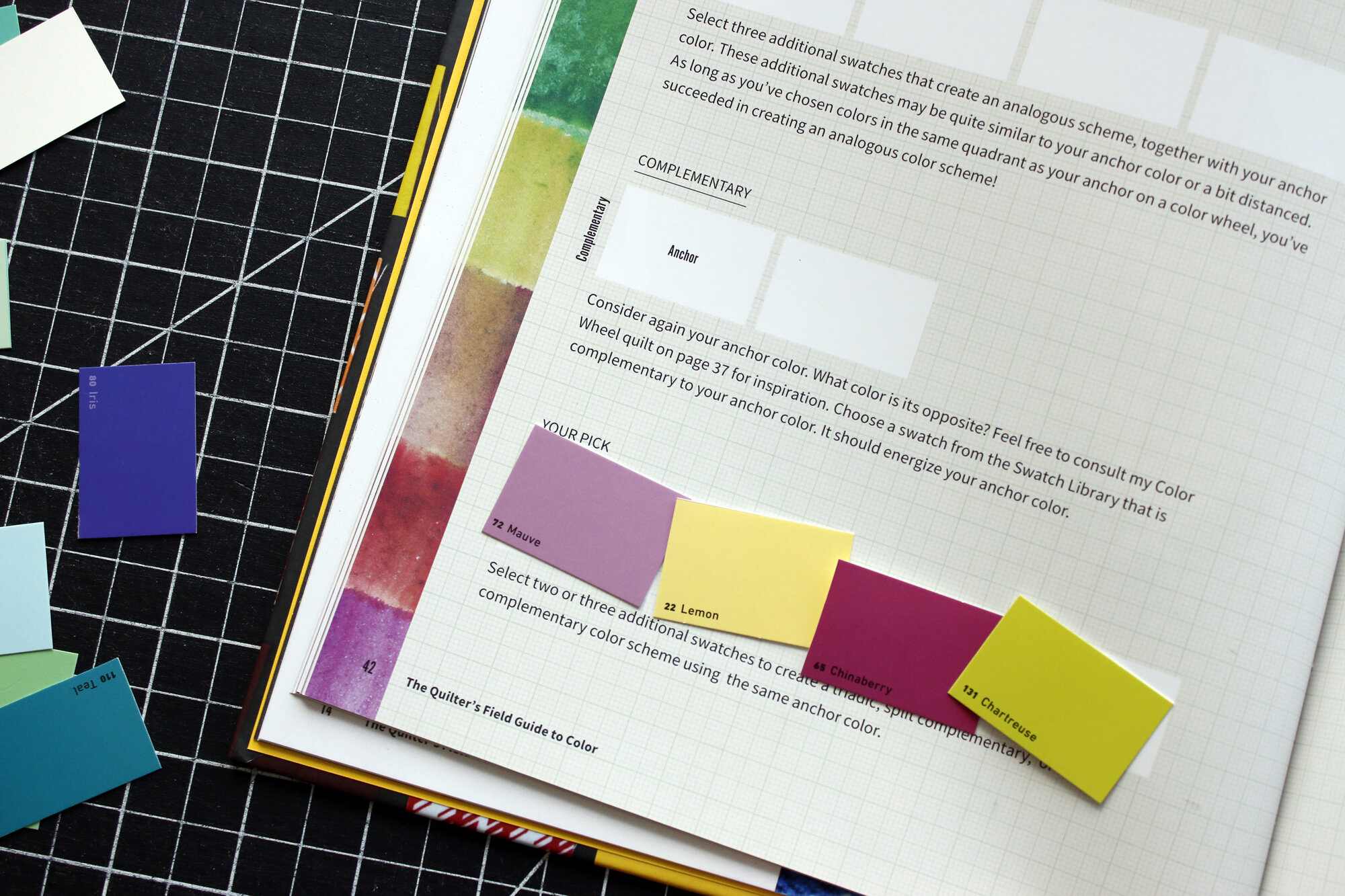
Here at the bottom of the page, the prompt is more open-ended. I chose to add another complementary color pairing, Chinaberry and Chartreuse, to my Mauve/Lemon couple. This yields a double complementary scheme, which again feels promising. It definitely has a lot of pizazz, with that complementary energy!

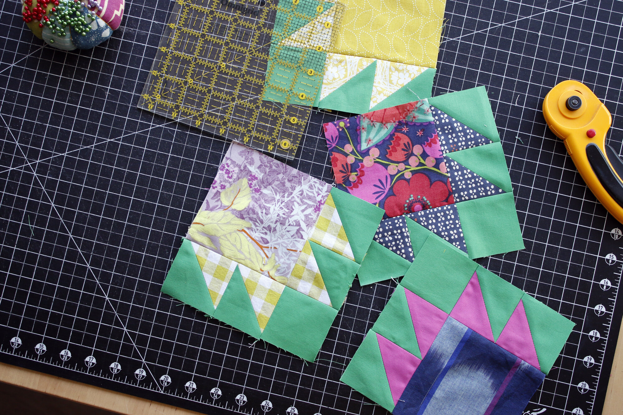
I liked my color swatch play so much that I decided to try make patchwork blocks based on the color swatches from my exercise. The Mauve/Lemon combo wasn’t hard to create, since it only requires two colors.

But the analogous block is challenging. In the end I settled for 3 out of 4 of the colors in my swatch challenge: Mauve, Chinaberry and Midnight.
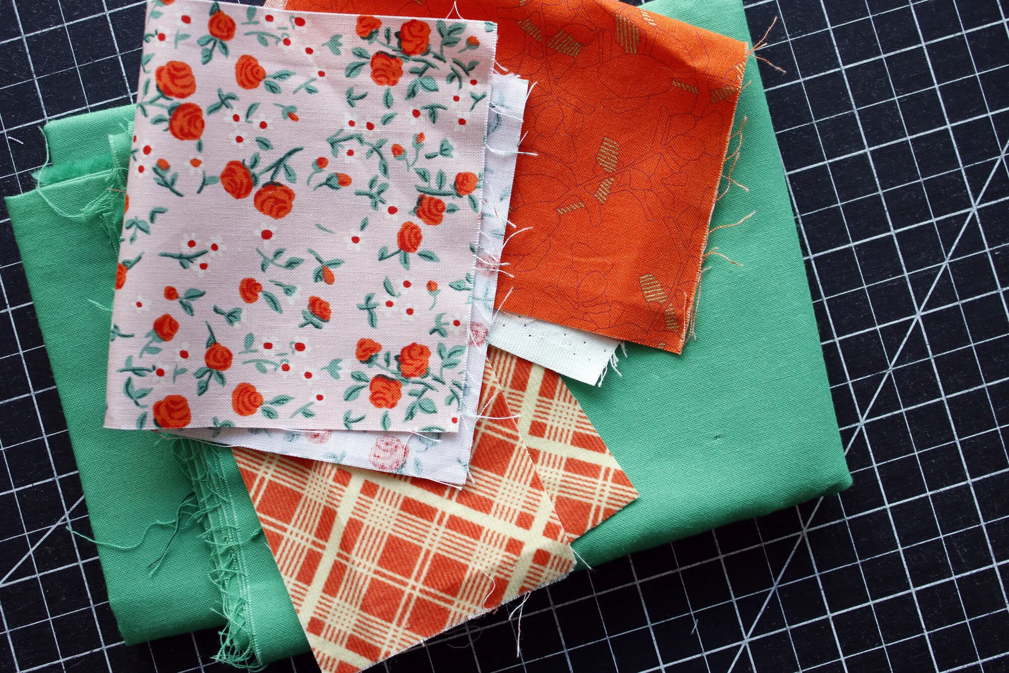
I also followed the Patchwork Challenge prompt on page 43, which instructs us to begin with a fabric we absolutely love. This soft Trixie floral by Heather Ross is one of my favorites. I hadn’t realized before that it has a complementary color scheme - red and green. With my green background fabric, I can really emphasize that! I decided to use the floral as the paw and was deciding between these two as the claws. The more solid red-orange fabric really pops, but would it be too loud?

In the end, I thought so. Even though the Trixie floral is complementary, it’s softened by the pale peach background. Using the gentler red-orange plaid suits the spirit of the print more so.
Here are my Color Wheel blocks!

With the Kona Fern green background, the color relationships aren’t so pure, but that’s ok. I’m having fun with it and loving the results. And that’s definitely what matters!
Ok, now let’s see yours. =)