Pink Latte in progress
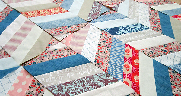
Progress on my herringbone quilt didn't start off too smoothly. Yes, even with the best laid plans (i.e. that long and considered fabric selection process), my first herringbone block was not what I had in mind.
Oh, you thought that only happens to you? Nope!
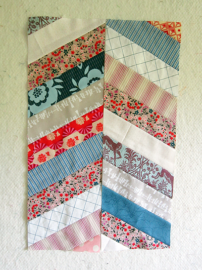
Here's the block before making my changes. After giving it some thought, I decided the block is too cluttered. I want to create a luxurious, pretty quilt with a calm, cultured personality. This one is feeling more granny chic - also a good look, but not what I had in mind. I decided I shouldn't use both of my dark value prints (the dark navy and bright coral fabrics) in the same block. They distract too much from my inspiration print.
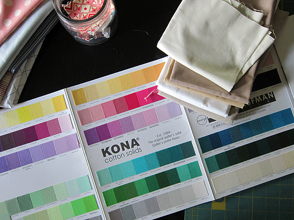
So what does it need? Solids, of course! I added a healthy dose of Kona Parchment, Kona Sky and Kona Oyster to create visual space that calms down the work.
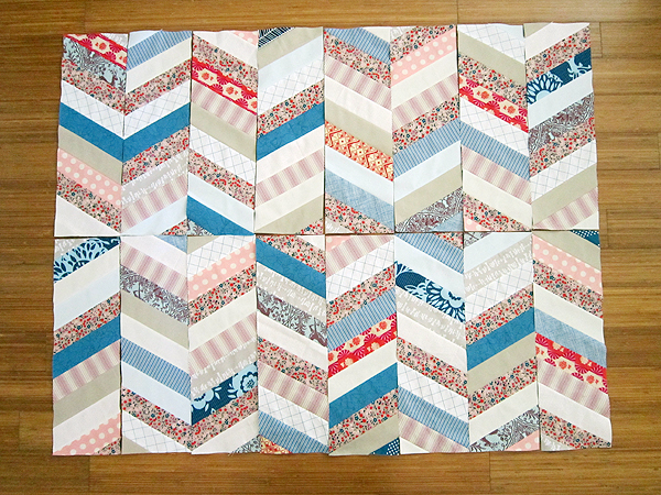
And here we are! I wonder, can you see the difference between my original test block (shown above on the design wall) and where I'm at now? It feels a lot more zen to me. And see how the dark value prints are just sprinkles? Now they don't take over the work.
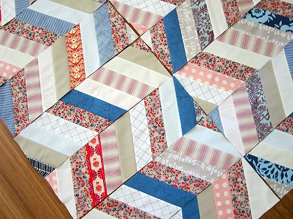
I'm happy with my pink latte progress! Perhaps a favorite feature is those diamond intersections developing horizontally between the block rows. I adore the extra dimension! It's not something I originally planned for, but a little shift of the blocks did the trick.
Patchwork surprises. Gotta love that!
