Storm at Sea
When I returned to my sewing today I snapped a picture of How I Left It.
Sometimes the fabrics are so refreshing a sight on return that I'm tempted to just stare at them in a warm and fuzzy kind of daze.
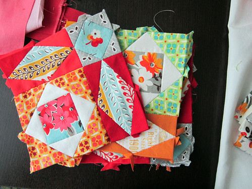
"Storm at Sea," isn't that a lovely phrase? It's also the name of four little blocks I English Paper Pieced this week as part of my progress on the Handstitched class quilt. I used a set of template papers from PaperPieces.com. (Don't run out and buy them now, if you're planning on taking the class. There's going to be a custom set of pieces for another class project that I think you'll want to throw in your cart as well. Hold tight! Also, FYI, purchasing paper pieces is optional as printouts will be included with the class.) Anyways, with English Paper Piecing, you use the papers to help you create precise shapes and sew the shapes together by hand. It's an odd concept at first, but once you try it out, you'll find it easy enough. I'll be teaching 3 English Paper Pieced projects in the class, one of which will have lots of Y-seams, which this method makes oh-so-easy.
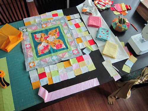
I've been working on the third layer of my Handstitched quilt. This medallion-style quilt begins with reverse applique Dogwood Blossom at center, then the Satin & Jewels ring of embroidery, and this week, a wider round with tile patchwork and intricate storm at sea corner blocks. The English Paper Piecing was easy and fun. I enjoyed a little fussy-cutting! But, the patchwork puzzled me.
I wanted to use warm colors pulled from the Flea Market Fancy line (my color-inspiration for this project). Since I had used cool colors strongly in the Dogwood Blossom center, I figured it would be good to pull the warm colors through via the tile patchwork.
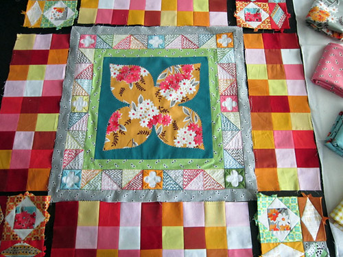
But, when I set my warm tiles beside the quilt center the patchwork grabs center stage. I added the gray seeds border to help define the embroidery section, but it seemed that the warm solids still captured all the attention. At the right I set out some Kona Snow and a smattering of prints that will be featured in the next layer of the quilt to see if that brought color balance. Still unsure.
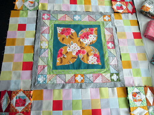
So today, I used a precious block of dedicated sewing time to bust out a soft, understated version of patchwork tile. This time I mixed in a pale blue, spring green and gray, thinking maybe the tile didn't need to be oh-so-warm. I wonder which one you like best?
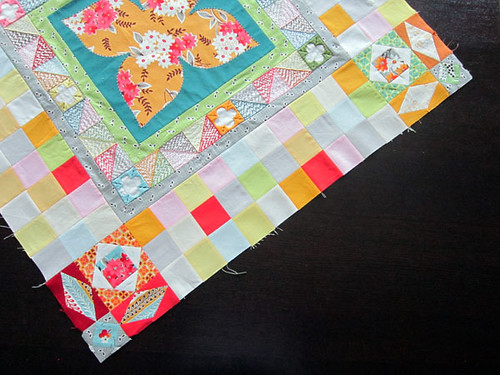
Even now I have trouble choosing and usually I am all for more saturation, but this time I decided to piece in the softer version. I want the eye to mostly wash over the tile to rest more so on the other aspects of the quilt. I think this version is what I really intended when I designed the quilt, even if my instinct initially was to use more color, color, color. But, I do see that I'll need to use some of the dark teal Kona Everglade solid (probably along with some green seeds) in the next layer of this quilt to pull the darker values through. It's always a balance!
This coming week I'm going to make some non-quilt projects for Handstitched Class in preparation for opening registration. Registration will open during the second week of May, date to be announced next week along with a little surprise for my students. Have a nice weekend!
Sometimes the fabrics are so refreshing a sight on return that I'm tempted to just stare at them in a warm and fuzzy kind of daze.
"Storm at Sea," isn't that a lovely phrase? It's also the name of four little blocks I English Paper Pieced this week as part of my progress on the Handstitched class quilt. I used a set of template papers from PaperPieces.com. (Don't run out and buy them now, if you're planning on taking the class. There's going to be a custom set of pieces for another class project that I think you'll want to throw in your cart as well. Hold tight! Also, FYI, purchasing paper pieces is optional as printouts will be included with the class.) Anyways, with English Paper Piecing, you use the papers to help you create precise shapes and sew the shapes together by hand. It's an odd concept at first, but once you try it out, you'll find it easy enough. I'll be teaching 3 English Paper Pieced projects in the class, one of which will have lots of Y-seams, which this method makes oh-so-easy.
I've been working on the third layer of my Handstitched quilt. This medallion-style quilt begins with reverse applique Dogwood Blossom at center, then the Satin & Jewels ring of embroidery, and this week, a wider round with tile patchwork and intricate storm at sea corner blocks. The English Paper Piecing was easy and fun. I enjoyed a little fussy-cutting! But, the patchwork puzzled me.
I wanted to use warm colors pulled from the Flea Market Fancy line (my color-inspiration for this project). Since I had used cool colors strongly in the Dogwood Blossom center, I figured it would be good to pull the warm colors through via the tile patchwork.
But, when I set my warm tiles beside the quilt center the patchwork grabs center stage. I added the gray seeds border to help define the embroidery section, but it seemed that the warm solids still captured all the attention. At the right I set out some Kona Snow and a smattering of prints that will be featured in the next layer of the quilt to see if that brought color balance. Still unsure.
So today, I used a precious block of dedicated sewing time to bust out a soft, understated version of patchwork tile. This time I mixed in a pale blue, spring green and gray, thinking maybe the tile didn't need to be oh-so-warm. I wonder which one you like best?
Even now I have trouble choosing and usually I am all for more saturation, but this time I decided to piece in the softer version. I want the eye to mostly wash over the tile to rest more so on the other aspects of the quilt. I think this version is what I really intended when I designed the quilt, even if my instinct initially was to use more color, color, color. But, I do see that I'll need to use some of the dark teal Kona Everglade solid (probably along with some green seeds) in the next layer of this quilt to pull the darker values through. It's always a balance!
This coming week I'm going to make some non-quilt projects for Handstitched Class in preparation for opening registration. Registration will open during the second week of May, date to be announced next week along with a little surprise for my students. Have a nice weekend!
