How about this?
Oooh, that was FUN! You all had so many great ideas for rescuing my fabrics that weren't playing nicely.
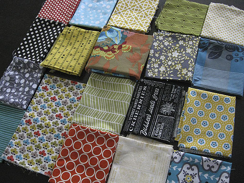
Here's a little summary of your advice:
**Ditch the large Anna Maria Horner floral, which was the brown and orange oversized print showing up tallest in the photo. This print is too brown to combine with the blacks and grays. It "muddies" it up.
**Add solids
**Not enough contrast in values. Add darker and lighter fabrics.
**Too busy/Conflicting prints. With this many prints and colors, the patterns need a bit more unity. This mix includes vintage-inspired florals, modern florals, text prints, simple and complex geometrics. Yowzers.
**Try removing florals
**There are too many dots
**Try removing all the grays
**Add more turquoise or another bright color like chartreuse green.
**The black doesn't work, Rachel. You've got to get over it (just kidding, you were nice ;).
The most common overall suggestion was to drop the brown/orange Anna Maria Horner (AMH) print. You guys! Do you know that you're totally siding with Brandon? I asked my husband what was going wrong on day 1 and he immediately identified that print. I thought, "Heck, what does he know?" Apparently, a lot.
The argument I gave him was the same as Tamara's comment: "If they are going to be in 1 1/2 in squares the AMH fabric is going to give you some pops of blue and the burnt orange. It wont appear like it does there. It will appear as 3 or 4 different fabrics and all of them work." He didn't buy it. And, I don't think most of you would either. The trouble is it's very hard to predict how a large floral like that will read when cut up into small pieces. Will it look like anything? Will it look like mush? And, am I really going to be happy with the brown-ish background parts? Probably not.
After getting a very delicious dose of your comments, last night I set out to rework the group. I started with my inspiration fabric again. Guided by Emma's suggestion to make sure the prints I chose fit with the simple aesthetic of the two-dimensional inspiration print. I looked for "flat", simple florals only. I also decided to drop the gray, but I held onto that black. Quite stubbornly.
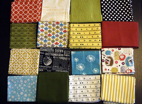
In this improved mix, you'll notice I switched out the old turquoise/gray prints for a simpler dandelion print. I changed the vintage-inspired yellow/blue floral for a simple yellow stripe. To enhance the light dimension, I added two prints on white backgrounds (the white measuring tape and multi-colored animals). And, to enhance the dark dimension, I added solid dark green (Kona Avocado) and solid dark orange-red (Kona Paprika). And, lastly, to brighten the mood I added a brilliant shade of solid green in the top row.
Altogether this is LESS fabrics than my first group, plus it includes three solids. That combined with the simpler prints makes a group that doesn't feel busy. I like that it has a strong color message, while still incorporating that black and white feel that I'm enjoying lately. Yep, I love it!
Only, I'm not sure what I'll do with it.
You see, I was way too impatient after sleeping on it that first night to wait any longer to start my 1.5" square patchwork project. Since I couldn't get the first group to work, I put together a completely different palette based on the realization that I really wanted to work with turquoise and gray.
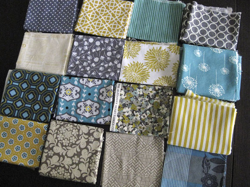
A limited color palette is more of a stretch for me than just about anything else. But I do agree that when you limit the palette you gain the freedom to throw in a greater variety of prints, which creates that scrapalicious vibe that I was feeling for this project.
Here's a sneak peak of the fabrics I chose to work with. Mmmmmm
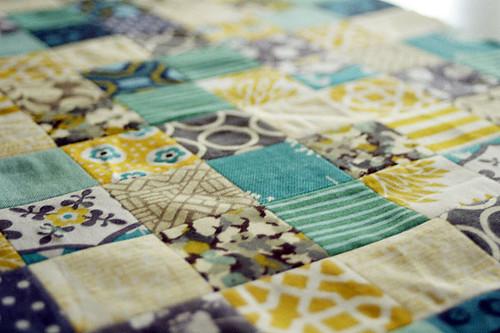
Now, you won't see the rest of this anytime soon because it's actually a sample project for my imaginary book. This is the ho-hum, ordinary part. I best keep the rest under wraps! I'm guessing that if you're still reading, you're a regular reader of my blog and may know that I've been working towards a book for the greater part of this year. I'm now in the phase of fielding questions from publishers interested in my book proposal. It's really amazing to see that people are actually interested!
I'm likely to make a few more samples this month and then... then I hope I'll be signing a contract to start working on the real, final book project versions. So, if you hear me jabbering about making something (like 1.5" square patchwork) but never see it, just assume I'm prevented under threat of death from sharing the actual project, and believe that I'm not all talk and no action. All shall be revealed in the end. Book or no book. I promise.
Here's a little summary of your advice:
**Ditch the large Anna Maria Horner floral, which was the brown and orange oversized print showing up tallest in the photo. This print is too brown to combine with the blacks and grays. It "muddies" it up.
**Add solids
**Not enough contrast in values. Add darker and lighter fabrics.
**Too busy/Conflicting prints. With this many prints and colors, the patterns need a bit more unity. This mix includes vintage-inspired florals, modern florals, text prints, simple and complex geometrics. Yowzers.
**Try removing florals
**There are too many dots
**Try removing all the grays
**Add more turquoise or another bright color like chartreuse green.
**The black doesn't work, Rachel. You've got to get over it (just kidding, you were nice ;).
The most common overall suggestion was to drop the brown/orange Anna Maria Horner (AMH) print. You guys! Do you know that you're totally siding with Brandon? I asked my husband what was going wrong on day 1 and he immediately identified that print. I thought, "Heck, what does he know?" Apparently, a lot.
The argument I gave him was the same as Tamara's comment: "If they are going to be in 1 1/2 in squares the AMH fabric is going to give you some pops of blue and the burnt orange. It wont appear like it does there. It will appear as 3 or 4 different fabrics and all of them work." He didn't buy it. And, I don't think most of you would either. The trouble is it's very hard to predict how a large floral like that will read when cut up into small pieces. Will it look like anything? Will it look like mush? And, am I really going to be happy with the brown-ish background parts? Probably not.
After getting a very delicious dose of your comments, last night I set out to rework the group. I started with my inspiration fabric again. Guided by Emma's suggestion to make sure the prints I chose fit with the simple aesthetic of the two-dimensional inspiration print. I looked for "flat", simple florals only. I also decided to drop the gray, but I held onto that black. Quite stubbornly.
In this improved mix, you'll notice I switched out the old turquoise/gray prints for a simpler dandelion print. I changed the vintage-inspired yellow/blue floral for a simple yellow stripe. To enhance the light dimension, I added two prints on white backgrounds (the white measuring tape and multi-colored animals). And, to enhance the dark dimension, I added solid dark green (Kona Avocado) and solid dark orange-red (Kona Paprika). And, lastly, to brighten the mood I added a brilliant shade of solid green in the top row.
Altogether this is LESS fabrics than my first group, plus it includes three solids. That combined with the simpler prints makes a group that doesn't feel busy. I like that it has a strong color message, while still incorporating that black and white feel that I'm enjoying lately. Yep, I love it!
Only, I'm not sure what I'll do with it.
You see, I was way too impatient after sleeping on it that first night to wait any longer to start my 1.5" square patchwork project. Since I couldn't get the first group to work, I put together a completely different palette based on the realization that I really wanted to work with turquoise and gray.
A limited color palette is more of a stretch for me than just about anything else. But I do agree that when you limit the palette you gain the freedom to throw in a greater variety of prints, which creates that scrapalicious vibe that I was feeling for this project.
Here's a sneak peak of the fabrics I chose to work with. Mmmmmm
Now, you won't see the rest of this anytime soon because it's actually a sample project for my imaginary book. This is the ho-hum, ordinary part. I best keep the rest under wraps! I'm guessing that if you're still reading, you're a regular reader of my blog and may know that I've been working towards a book for the greater part of this year. I'm now in the phase of fielding questions from publishers interested in my book proposal. It's really amazing to see that people are actually interested!
I'm likely to make a few more samples this month and then... then I hope I'll be signing a contract to start working on the real, final book project versions. So, if you hear me jabbering about making something (like 1.5" square patchwork) but never see it, just assume I'm prevented under threat of death from sharing the actual project, and believe that I'm not all talk and no action. All shall be revealed in the end. Book or no book. I promise.
