sometimes it's tricky
Today there's a hands-on experiment for those of us working on using value in our quilts. Amy at Badskirt has a friendly lesson (with a nerd teaser, don't miss that!) and also your homework assignment. Happily, it involves playing with fabric!
Like the good girl I am I got right to it. Of course, I did have a head start...
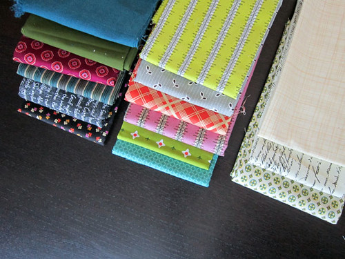
Here are the fabrics I actually used in my Value Dance quilt. I've sorted them in mini-stacks by darks, mediums and lights, with darkest fabrics on the bottom and lightest fabrics on the top. So, the darkest dark is on the very bottom of the dark stack. Makes sense?

Now I've taken all three stacks and made one tall stack to test my value sorting skills. See that bright lime fabric about mid-way? I wonder if that's too low in the stack? In other words, I'm wondering if it is a lighter value than I'd guessed.
Below I've "desaturated" the image, which you can do in Photoshop, in Aviary (via Flickr) or at Pic Monkey.

Making the image black and white is a simplistic way to check the value gradient. Right away, a few fabrics stick out to me as possibly misplaced in the spectrum.
I've labeled the yellow fabric (heatwave stripe) that reads darker than I expected in black and white. But, I'd argue that it may be rightly placed after all since yellow feels lighter than other colors. Know what I mean? As Amy alluded to in her post, color is pretty complex.
Then lower I've labeled the teal fabric (cross square) that now seems to be lighter value than the lime green one just above it. I had worried the lime green fabric was light (probably because it's yellow-ish), but it reads plenty dark in black and white. Hmm...
Well, even if you or I struggle to order a multi-colored fabric stack precisely, the good news is we only need to separate our fabrics into lights vs. darks or lights/mediums/darks depending on our value quilt design. So, no stress! Just a learning exercise here. And a good one!

Here are a few Chicopee prints that I wanted to include in my quilt. From left that's Simple Plaid Lime, Red Bleeding Heart (which looks orange) and Black Voltage Dot.

My instinct was to sort them like so. What do you think?

Here in black and white you can see that such sorting would be mostly right. Maybe the Simple Plaid print should go in the medium values? But, back in full color, it just looks too dark to me for that!

In the end, I didn't use any of those three fabrics. The Black Voltage Dot was too distracting with it's black dots for the way I wanted to use light values in my quilt. I preferred much more subtle light prints. When choosing your fabrics, prints with white backgrounds and dark elements will probably be hard to place.
The Simple Plaid feels dark, but the lime stripes make it appear lighter from farther away (another way to check value). It's so borderline that it seemed wiser to exclude it so that the complex value relationships in Value Dance would be able to emerge.
Along the same lines, I decided to exclude the orange-looking Bleeding Heart print. It felt darker than my other medium values, but obviously not dark enough to go into the darks pile.
What's the point? It's this. If you're new to value start by using fabrics that clearly fall into one camp or another. If you use those borderline fabrics you may be frustrated later on when your quilt doesn't read the value pattern you had envisioned. I'm betting that as we continue to build our experience, we'll do better with those tricky fabrics!
I hope you're enjoying the Value Added Quilt-Along so far. You're invited to add your fabric stacks to the quilt-along flickr pool and join in on the discussion. Amy's asked how comfortable you are feeling now with value. I'd love to know too!
Like the good girl I am I got right to it. Of course, I did have a head start...
Here are the fabrics I actually used in my Value Dance quilt. I've sorted them in mini-stacks by darks, mediums and lights, with darkest fabrics on the bottom and lightest fabrics on the top. So, the darkest dark is on the very bottom of the dark stack. Makes sense?
Now I've taken all three stacks and made one tall stack to test my value sorting skills. See that bright lime fabric about mid-way? I wonder if that's too low in the stack? In other words, I'm wondering if it is a lighter value than I'd guessed.
Below I've "desaturated" the image, which you can do in Photoshop, in Aviary (via Flickr) or at Pic Monkey.
Making the image black and white is a simplistic way to check the value gradient. Right away, a few fabrics stick out to me as possibly misplaced in the spectrum.
I've labeled the yellow fabric (heatwave stripe) that reads darker than I expected in black and white. But, I'd argue that it may be rightly placed after all since yellow feels lighter than other colors. Know what I mean? As Amy alluded to in her post, color is pretty complex.
Then lower I've labeled the teal fabric (cross square) that now seems to be lighter value than the lime green one just above it. I had worried the lime green fabric was light (probably because it's yellow-ish), but it reads plenty dark in black and white. Hmm...
Well, even if you or I struggle to order a multi-colored fabric stack precisely, the good news is we only need to separate our fabrics into lights vs. darks or lights/mediums/darks depending on our value quilt design. So, no stress! Just a learning exercise here. And a good one!
Here are a few Chicopee prints that I wanted to include in my quilt. From left that's Simple Plaid Lime, Red Bleeding Heart (which looks orange) and Black Voltage Dot.
My instinct was to sort them like so. What do you think?
Here in black and white you can see that such sorting would be mostly right. Maybe the Simple Plaid print should go in the medium values? But, back in full color, it just looks too dark to me for that!
In the end, I didn't use any of those three fabrics. The Black Voltage Dot was too distracting with it's black dots for the way I wanted to use light values in my quilt. I preferred much more subtle light prints. When choosing your fabrics, prints with white backgrounds and dark elements will probably be hard to place.
The Simple Plaid feels dark, but the lime stripes make it appear lighter from farther away (another way to check value). It's so borderline that it seemed wiser to exclude it so that the complex value relationships in Value Dance would be able to emerge.
Along the same lines, I decided to exclude the orange-looking Bleeding Heart print. It felt darker than my other medium values, but obviously not dark enough to go into the darks pile.
What's the point? It's this. If you're new to value start by using fabrics that clearly fall into one camp or another. If you use those borderline fabrics you may be frustrated later on when your quilt doesn't read the value pattern you had envisioned. I'm betting that as we continue to build our experience, we'll do better with those tricky fabrics!
I hope you're enjoying the Value Added Quilt-Along so far. You're invited to add your fabric stacks to the quilt-along flickr pool and join in on the discussion. Amy's asked how comfortable you are feeling now with value. I'd love to know too!
